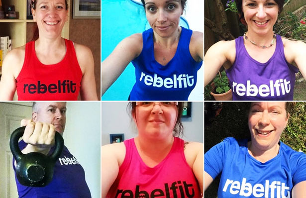
A Little Bit Of Rebelfit History!
posted on: February 17, 2017. posted in: Weight loss, Nutrition
We've had a few people message us to ask what the line in the 'b' of Rebelfit is for. Take a look at our logo and have a guess for yourself...
![]()
Guesses have included...
"The bit on a heart rate monitor!"
"The journey with ups and downs!"
"The teeth roaring like a rebel!"
And my personal favourite...
"My arse, because it's wobbly!"
So here's the deal.
Four years ago Rebelfit did not exist. We were called OSP Bootcamp, "The world's first virtual bootcamp". The OSP stood for "Operation Six Pack".
The branding didn't look right, feel right or sound right. And most importantly of alI, it didn't reflect the amazing people who made up this awesome group.
So thanks to my big brother (who worked for a top branding company) OSP was given a much needed rebrand. The branding guys came in and they took part in a mission. They lived and breathed OSP to find out what it was all about.
They studied the business, and the customers (you guys!), to find out what was the "core value" that defined us as a brand. Then went away, brainstormed their ideas, then over a curry and a few beers they gave me their answer.
"Liam, OSP isn't a bootcamp. It is a REBELLION!!"
The people on OSP had been broken...
The health of a nation had been broken...
A whole generation had been broken...
By a slimming industry that encouraged them to cut out fat, live on processed food, avoid exercise and make weight loss their sole obsession and goal.
Forget health. Forget fitness. Forget happiness.
In their desperate attempts to lose weight they were starving themselves on diets, replacing real food like avocados with processed food like curly wurlys, wrecking their metabolism and ultimately getting FATTER for it!
By launching OSP we became pioneers of a revolution against a slimming industry that was out to profit from our obesity.
Quite simply...
We had REBELLED!
We were eating real food, not diet food.
We were focused on fitness, not weight loss.
We were going against the experts and the health authorities and the scientists who told us fat was bad because we were the first people to realise....
They had got it wrong!
Diets make you fatter, not leaner, longer term!
There was only one name that could reflect our passion.
And that name was REBELFIT.
So why the wibbly bit in the b?
I asked the graphic designer to incorporate something in the logo that reflected what Rebelfit was about. Something that wasn't obvious, but that if you knew it, you got it.
In the book 'Animal Farm' by George Orwell rebellion is a key theme. Napoleon tells the hens to give up their eggs and when they refuse, he deliberately tries to STARVE them.
In response they start a rebellion...
"Led by three young Black Minorca pullets, the hens made a determined effort to thwart Napoleon's wishes. Their method was to fly up to the rafters and there lay their eggs, which smashed to pieces on the floor."
So what you are looking at in the 'b' of the logo isn't a wibble.
It is a BROKEN EGG.

It is a symbol of our rebellion against a flawed slimming industry that tried to make us give up our eggs!!
And what better symbol of our rebellion than something which has to break in order to unleash new life.
Think about that one ;)
Liam